DEVLOG
React CSS 스타일링 :: styled-components (2) 본문
React CSS 스타일링 :: styled-components
REACT에서 스타일링할 때는 다양한 방식이 있고 그 중에서 정답은 없다! 회사에서 사용하는 스킬, 개발자마다 각자의 취향에 따라 선택하기 때문ㅠ.ㅠ 일반적으로 다음과 같은 스타일링 방법들이
mesonia.tistory.com
이론과 실습1에 이어서 눈알이 빙빙 돌아가는 실습2도 공부해보자해보자:)
styled-components 실습2
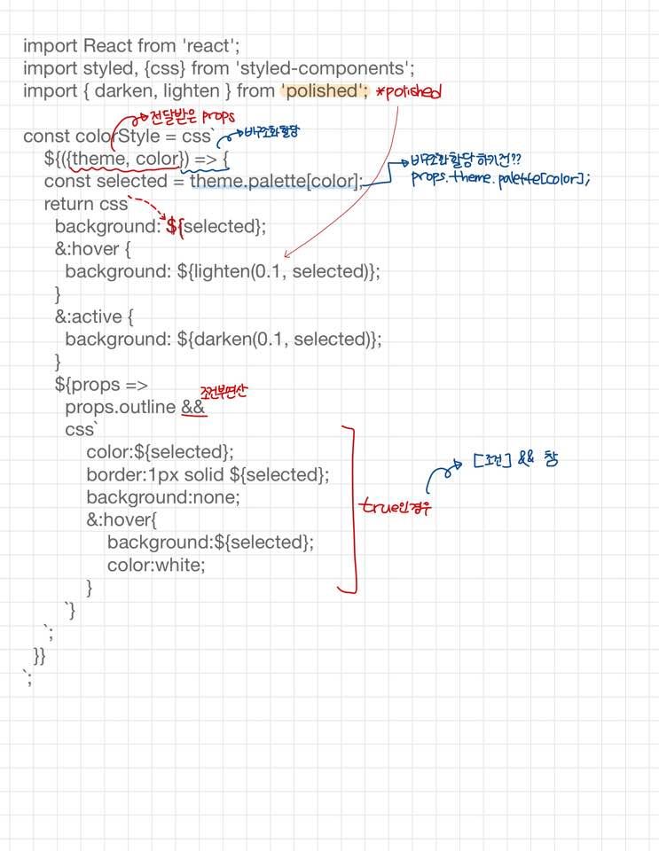
Button.js
import React from 'react';
import styled, {css} from 'styled-components';
import { darken, lighten } from 'polished';
const colorStyle = css`
${({theme, color}) => {
const selected = theme.palette[color];
return css`
background: ${selected};
&:hover {
background: ${lighten(0.1, selected)};
}
&:active {
background: ${darken(0.1, selected)};
}
${props =>
props.outline &&
css`
color:${selected};
border:1px solid ${selected};
background:none;
&:hover{
background:${selected};
color:white;
}
`}
`;
}}
`;
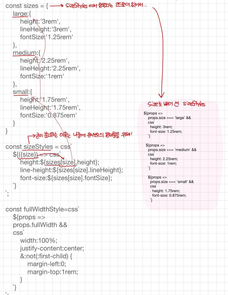
const sizes = {
large:{
height:'3rem',
lineHeight:'3rem',
fontSize:'1.25rem'
},
medium:{
height:'2.25rem',
lineHeight:'2.25rem',
fontSize:'1rem'
},
small:{
height:'1.75rem',
lineHeight:'1.75rem',
fontSize:'0.875rem'
}
}
const sizeStyles = css`
${({size}) => css`
height:${sizes[size].height};
line-height:${sizes[size].lineHeight};
font-size:${sizes[size].fontSize};
`}
`;
const fullWidthStyle=css`
${props =>
props.fullWidth &&
css`
width:100%;
justify-content:center;
&:not(:first-child) {
margin-left:0;
margin-top:1rem;
}
`}
`;
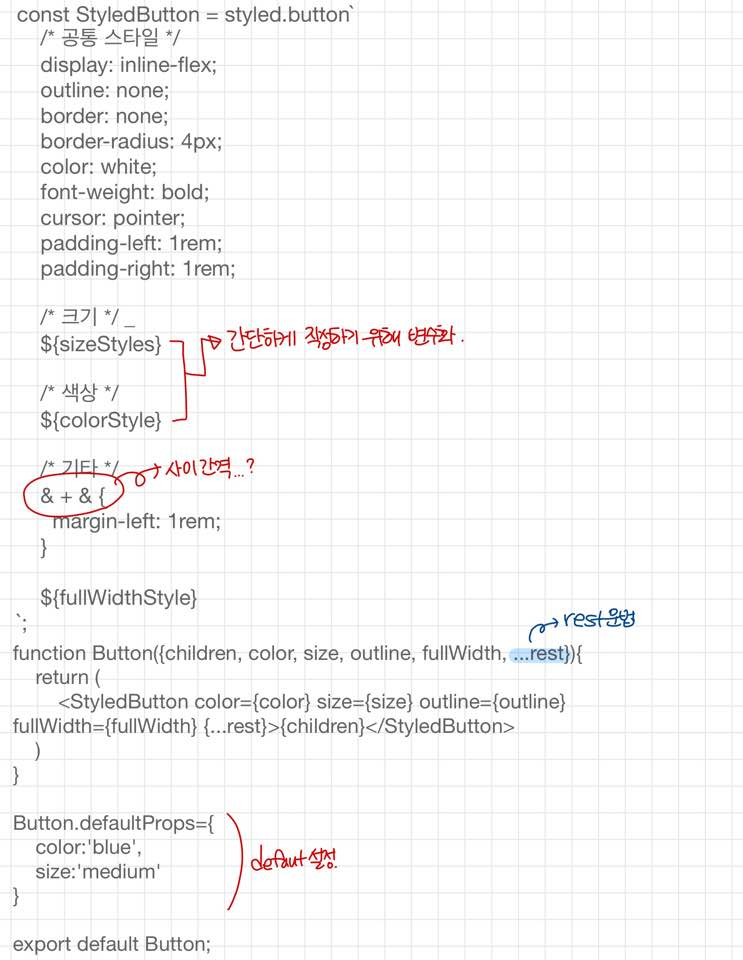
const StyledButton = styled.button`
/* 공통 스타일 */
display: inline-flex;
outline: none;
border: none;
border-radius: 4px;
color: white;
font-weight: bold;
cursor: pointer;
padding-left: 1rem;
padding-right: 1rem;
/* 크기 */
${sizeStyles}
/* 색상 */
${colorStyle}
/* 기타 */
& + & {
margin-left: 1rem;
}
${fullWidthStyle}
`;
function Button({children, color, size, outline, fullWidth, ...rest}){
return (
<StyledButton color={color} size={size} outline={outline} fullWidth={fullWidth} {...rest}>{children}</StyledButton>
)
}
Button.defaultProps={
color:'blue',
size:'medium'
}
export default Button;Dialog.js
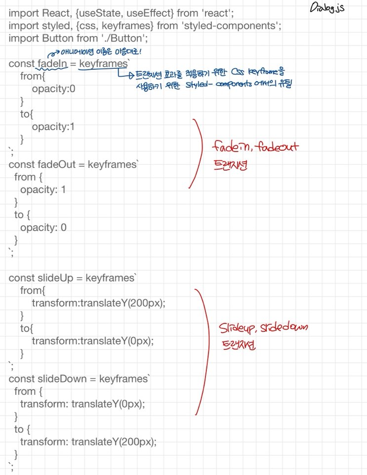
import React, {useState, useEffect} from 'react';
import styled, {css, keyframes} from 'styled-components';
import Button from './Button';
const fadeIn = keyframes`
from{
opacity:0
}
to{
opacity:1
}
`;
const fadeOut = keyframes`
from {
opacity: 1
}
to {
opacity: 0
}
`;
const slideUp = keyframes`
from{
transform:translateY(200px);
}
to{
transform:translateY(0px);
}
`;
const slideDown = keyframes`
from {
transform: translateY(0px);
}
to {
transform: translateY(200px);
}
`;
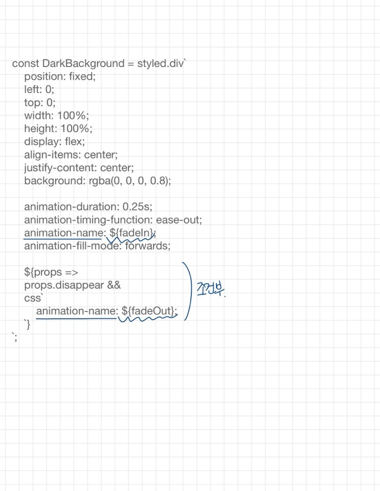
const DarkBackground = styled.div`
position: fixed;
left: 0;
top: 0;
width: 100%;
height: 100%;
display: flex;
align-items: center;
justify-content: center;
background: rgba(0, 0, 0, 0.8);
animation-duration: 0.25s;
animation-timing-function: ease-out;
animation-name: ${fadeIn};
animation-fill-mode: forwards;
${props =>
props.disappear &&
css`
animation-name: ${fadeOut};
`}
`;
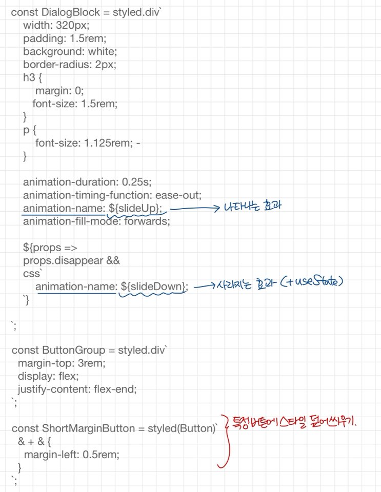
const DialogBlock = styled.div`
width: 320px;
padding: 1.5rem;
background: white;
border-radius: 2px;
h3 {
margin: 0;
font-size: 1.5rem;
}
p {
font-size: 1.125rem;
}
animation-duration: 0.25s;
animation-timing-function: ease-out;
animation-name: ${slideUp};
animation-fill-mode: forwards;
${props =>
props.disappear &&
css`
animation-name: ${slideDown};
`}
`;
const ButtonGroup = styled.div`
margin-top: 3rem;
display: flex;
justify-content: flex-end;
`;
const ShortMarginButton = styled(Button)`
& + & {
margin-left: 0.5rem;
}
`;
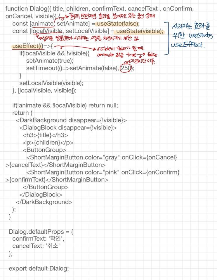
function Dialog({ title, children, confirmText, cancelText , onConfirm, onCancel, visible}) {
const [animate, setAnimate] = useState(false);
const [localVisible, setLocalVisible] = useState(visible);
useEffect(()=>{
if(localVisible && !visible){
setAnimate(true);
setTimeout(()=>setAnimate(false), 250);
}
setLocalVisible(visible);
}, [localVisible, visible]);
if(!animate && !localVisible) return null;
return (
<DarkBackground disappear={!visible}>
<DialogBlock disappear={!visible}>
<h3>{title}</h3>
<p>{children}</p>
<ButtonGroup>
<ShortMarginButton color="gray" onClick={onCancel}>{cancelText}</ShortMarginButton>
<ShortMarginButton color="pink" onClick={onConfirm}>{confirmText}</ShortMarginButton>
</ButtonGroup>
</DialogBlock>
</DarkBackground>
);
}
Dialog.defaultProps = {
confirmText: '확인',
cancelText: '취소'
};
export default Dialog;App.js
import React, {useState} from 'react';
import styled, { css, ThemeProvider } from 'styled-components';
import Button from './components/Button';
import Dialog from './components/Dialog';

const Circle = styled.div`
  width: 5rem;
  height: 5rem;
  background: ${props => props.color || 'black'};
  border-radius: 50%;
  ${props =>
    props.huge &&
    css`
      width:10rem;
      height:10rem;
    `}
`;

const AppBlock = styled.div`
  width: 512px;
  margin: 0 auto;
  margin-top: 4rem;
  border: 1px solid black;
  padding: 1rem;
`;

const ButtonGroup = styled.div`
  & + & {
    margin-top: 1rem;
  }
`;


function App() {
  const [dialog, setDialog] = useState(false);

  const onClick = () => {
    setDialog(true);
  };

  const onConfirm = () => {
    console.log('확인');
    setDialog(false);
  }

  const onCancel = () => {
    console.log('취소');
    setDialog(false);
  }

  return (
    <ThemeProvider
      theme={{
        palette:{
          blue:'#228be6',
          gray:'#495057',
          pink:'#f06595'
        }
      }}
    >
      <AppBlock>
        <ButtonGroup>
          <Button size="large">BUTTON</Button>
          <Button>BUTTON</Button>
          <Button size="small">BUTTON</Button>
        </ButtonGroup>
        <ButtonGroup>
          <Button color="gray" size="large">BUTTON</Button>
          <Button color="gray">BUTTON</Button>
          <Button color="gray" size="small">BUTTON</Button>
        </ButtonGroup>
        <ButtonGroup>
          <Button color="pink" size="large">BUTTON</Button>
          <Button color="pink">BUTTON</Button>
          <Button color="pink" size="small">BUTTON</Button>
        </ButtonGroup>
        <ButtonGroup>
          <Button size="large" outline>BUTTON</Button>
          <Button color="gray" outline>BUTTON</Button>
          <Button color="pink" size="small" outline>BUTTON</Button>
        </ButtonGroup>
        <ButtonGroup>
          <Button size="large" fullWidth>BUTTON</Button>
          <Button size="large" color="gray" fullWidth >BUTTON</Button>
          <Button size="large" color="pink" fullWidth onClick={onClick}>삭제</Button>
        </ButtonGroup>
      </AppBlock>

      <Dialog
        title="정말 삭제할라궁?"
        confirmText="삭제"
        cancelText="취소"
        onCancel={onCancel}
        onConfirm={onConfirm}
        visible={dialog}
      >
        데이터를 정말로 삭제하시겠습니까?
      </Dialog>
    </ThemeProvider>
  );
}

export default App;
길다길어..........
* 본 실습은 벨로퍼트님의 코드를 가져와 분석해본 실습입니다!
react.vlpt.us/styling/03-styled-components.html
Button.js부터 하나하나 뜯어보자구요...
* polished
Sass에서 lighten()또는 darken()과 같은 유틸 함수를 사용하여 색상에 변화를 줄 수 있었는데, CSS in JS에서도 비슷한 유틸함수를 사용하고 싶다면 polished 라이브러리를 설치하여 동일하게 사용하면 된다.
npm add polishedimport { darken, lighten } from 'polished';
...
background: #228be6;
&:hover {
background: ${lighten(0.1, '#228be6')};
}
&:active {
background: ${darken(0.1, '#228be6')};
}
Dialog.js
마지막으로 App.js 부분을 봐봅시다다다당
* ThemeProvider
색상코드를 지닌 변수를 Button.js에서 선언하는 대신 ThemeProvide라는 기능을 이용하여 styled-componentes로 만드는 모든 컴포넌트에서 조회하여 사용할 수 있는 전역적인 값을 설정해볼까나요!
function App() {
  return (
    <ThemeProvider
      theme={{
        palette: {
          blue: '#228be6',
          gray: '#495057',
          pink: '#f06595'
        }
      }}
    >
      <AppBlock>
        <Button>BUTTON</Button>
        <Button color="gray">BUTTON</Button>
        <Button color="pink">BUTTON</Button>
      </AppBlock>
    </ThemeProvider>
  );
}
이런식을 ThemeProvider에서 변수로 선언하고 실제 컴포넌트에서는 변수로 불러옴으로써 편리하게 값을 이용할 수 있지용~
const colorStyle = css`
    ${({theme, color}) => {
    const selected = theme.palette[color];
    return css`
      background: ${selected};
      &:hover {
        background: ${lighten(0.1, selected)};
      }
      &:active {
        background: ${darken(0.1, selected)};
      }
      ${props =>
        props.outline &&
        css`
            color:${selected};
            border:1px solid ${selected};
            background:none;
            &:hover{
                background:${selected};
                color:white;
            }
        `}
    `;
  }}
`;
styled-components에서 좋은점은 props값을 이용할 수 있다는 것!
js로 작업하고~ 클래스 주고~ css작업하고~ 이런 과정들을 싹 생략하고 한번에 해버린다는게 참 매력적입니당...
${({theme, color}) => {
    const selected = theme.palette[color];
위 코드처럼 props를 가져다가 변수에 저장하고
&{selected}템플릿 리터널내에서 이 변수를 사용해서 여러가지 작업들을 진행한다!
'frontend > react' 카테고리의 다른 글
| axios로 API 호출해서 데이터 받아오기 (0) | 2021.01.29 |
|---|---|
| [REACT Youtube API 사용하기] 1 :: Google APIs에서 Youtube API key 발급받기! (0) | 2021.01.29 |
| React CSS 스타일링 :: styled-components (0) | 2020.11.25 |
| [배포] React프로젝트 git pages로 배포하기 (0) | 2020.11.23 |
| React에서 FontAwesome 아이콘 사용하기 (0) | 2020.11.23 |


